WPPizza – A Restaurant Plugin for WordPress › Support › General Support › changed price position after update
- AuthorPosts
- 26 August, 2019 at 4:30 pm #44508
Hi Olly,
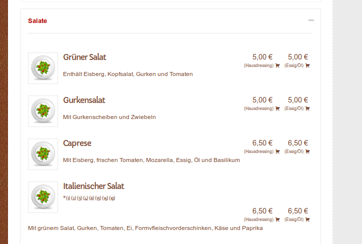
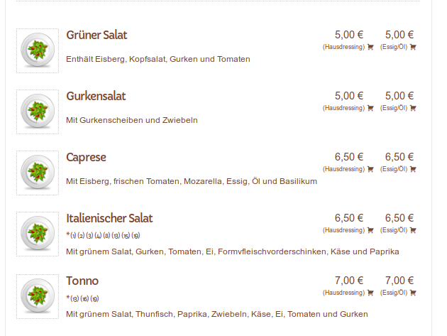
since the last update, the article prices switched the position under the additives.
It even overwrote the CSS settings of my child theme.I am not as good as I should be in CSS and I tried to figure out which changes where made, to make it happen.
I found the notice in the wppizza.default.css but it didn’t help me to fix it.My style has enough space to set the price on the right side, next to the name and the additives.
It’s curious after the update because when an article doesn’t have additives, the price stays in the correct position.I don’t heavy really the time after such changes to fix this, as I said some threads before.
This is how it looks like after the update and even with the use of a child theme:

And this is how it looks like before the update:

So please be kind and tell me, how to undo these changes.
26 August, 2019 at 5:18 pm #44512the order of the actual wrapping div, ul etc elements (prices, content text, title etc ) was changed slightly to make it possible to make things fit on a screen (affects default style only) when viewed on small screen devices while adding/changing *some* of the css to make this look as it did before
this was simply not doable before dynamically using media queries css and in mamy cases will have resulted in quite a messed up screen when using mobile devices..
that’s just as an explanation
with your multitude of additives for your italien salad, this might well cause an issue and i’ll look if i can account for this too.
In the meantime though – might also be the case – are you using any custom css on those elements ? perhaps simply removing any custom css there will also “fix” it so to speak (one might be overriding the other)I’ll have a look here too if i can reproduce your layout and see what happens, but if you could also check any custom css you might have and let me know , that would be great
Could you also send me the url of your site so i can have a look at the actual css that is being applied ?
thanks
26 August, 2019 at 7:43 pm #44513This reply has been marked as private.26 August, 2019 at 8:15 pm #44514>But with the custom css it worked very fine over a year and some updates
sure , as unless it is strictly necessary (and in this case it was unfortunately) , i do not change these kind of thingsthat aside.
i get a a ton of javascript errors on you site (you have done something like this<!--?php. that’s really not a good idea as it will still be read and parsed in all sorts of places)
i suspect you did that to disable your custom css (as i asked , and thanks for that)
However, looking at what we have now, i think it will be better in this case if you just leave things as you had them – including the css you were overriding – and I will see if i can come up with a line or 2 of css you can additionally add (or change) to get you back to where we were from a layout perspective26 August, 2019 at 8:24 pm #44515Okay.
due to the fact that (i’ve copied my wpppizza.style.css into the /wppizza/css folder) it normally worked on parent and child-theme this way, I’ve deactivated the child-theme and let it on the parent theme.Javascript errors should be done by now.
26 August, 2019 at 8:29 pm #44516Okay I dunno why…but somehow it looks in Browser actually pretty good (but not on child theme)
But it’s a complete mess on Smartphones because and again I dunno why, the additives are standing now directly after the article title and not under it. My god this CCS thing gonna kill me one day. 😮26 August, 2019 at 8:47 pm #44521> the additives are standing now directly after the article title
i’m not with you.
that’s the default behaviour (but you have overridden that span with display:block and whatnot which in turn pushes everything after down)it also resizes quite nicely when looking at it on a mobile device. i.e title above additives above prices – as intended and in fact the whole reason why the css/elements order was changed in wppizza 3.10
you sure you are not looking at some sort of cached version in your browser ?
26 August, 2019 at 8:53 pm #44522i.e you are doing
.wppizza-article-default .wppizza-article-additives{ display: block; /* etc */}
if you do/revert to
.wppizza-article-default .wppizza-article-additives{ display: inline-block; /* etc */}
additives are next to the title (as they are by default) and things dont move around all over the placeif you DO want the additives to be below the title (i.e keep the display:block)
then you could *add* this
.wppizza-article-default .wppizza-article-sizes { position: absolute;top: 0;right: 0;}BUT MAKE SURE you reset/remove this one again below 420px (as that’s where the media query kicks in that moves things underneath each other to cater for mobile devices )
26 August, 2019 at 8:54 pm #44523Hi,
okay please take look now.
I’ve rolled back to a backup before the update, so that you can see, how it was and I want it to have in the future as well. 🙂26 August, 2019 at 9:01 pm #44524i.e when resetting (i’m writing this out here – as reference to myself too – as i may even be adding this or similar as a default to the next update )
@media only screen and (max-width: 420px){
.wppizza-article-default .wppizza-article-sizes {position: unset !important;}
}
26 August, 2019 at 9:09 pm #44525>I’ve rolled back to a backup before the update, so that you can see, how it was and I want it to have in the future as well
the thing is, i dont think you want it like that .(hear me out)
have a look at it on a small screen , you will see that yoru prices are *above* the title.i have had quite a few reports where people ordered the wrong thing becuase they clicked on the price BELOW the title assuming – as would be pretty much expected throughout any ecommerce site – that the price below belongs to the title above it.
this is precisely the reason why this got changed ……
if you use the new version and add the below as the last of your custom css
.wppizza-article-default .wppizza-article-sizes { position: absolute;top: 0;right: 0;}
@media only screen and (max-width: 420px){
.wppizza-article-default .wppizza-article-sizes {position: unset !important;}
}
you will get the benefits from the above problem not happening on small screen devices , plus your “original” so to speak (i.e desktop/bigger screens) to be unaffected….
26 August, 2019 at 9:18 pm #44526PS: the easiest was/is always to simply use wppizza->layout->styles->responsive
(which always displays the title above everything else)However, I just happen to like the default layout myself (and alwasy did), but it does need a lot of css to make it work on different devices as it also depends on how many sizes there are for an item etc …
(again, that’s why the changes were made in 3.10 – to make it as usable as possible “out of the box” with any – or at least most – themes)…………
yes, i try to keep these relatively drastic changes to an absolute minimum, but it sometimes cannot be helped (to make things better for all) and if I do, I’m happy to hear about (and solve if at all possible) any issues
(Just felt the need to say this, lol)
26 August, 2019 at 9:35 pm #44527coming back to the added css i suggested , you might even want to add this
float: none !important;
so the whole thing would read like this.wppizza-article-default .wppizza-article-sizes { position: absolute;top: 0;right: 0;} @media only screen and (max-width: 420px){ .wppizza-article-default .wppizza-article-sizes {position: unset !important;float: none !important;} }that will keep th eprices centered on small screen devices (if you want that). obviously , you can tweak this as you wish
26 August, 2019 at 9:37 pm #44528Gnah, it maybe looks perfect but it’s not.
Because it should be:Article Name…….. Price
Additive………… SizeAnd the article name should be written into lines when it has 2 words which are not fitting into the line.
I dunno if I can explain it correctly. 🙁27 August, 2019 at 3:54 pm #44547Okay,
I checked it now on a lot of Smartphones.
I dunno why my Phone is the only one which shows a completely another style. (w/o cache)
So at the moment, it looks fine for me and the customers.So at this point, thank you very much. 🙂
27 August, 2019 at 4:45 pm #44548generally that all sounds good.
just out of interest though, what phone are you using there you have an issue with ?27 August, 2019 at 5:49 pm #44553This reply has been marked as private.27 August, 2019 at 7:17 pm #44554it really all depends on the amount of content you have and the device used (i.e ratio / width the screen has)
i dont know anything about the Mate20 Pro.
However ,having played with a few things, it seems to me it has a width of about 430 or soi can see 2 options.
a) the media queries in the original css kick in at 420 i.e it’s set to do@media only screen and (max-width: 420px){/* css stuff */}
you could change this to 440 for example (or something around that number). i.e
@media only screen and (max-width: 440px){/* css stuff */}
and the whole reshuffeling of things will occur earlieranother option would be to restrict the width that the title can take up , before it starts to linebreak
so, something like@media only screen and (max-width: 440px) and (min-width: 420px) {.wppizza-article-h2{display:inline-block; max-width:120px}}or similar – you’ll have to play with it a bit and or target only the items/categories where you need it
(or – as mentioned previously – use the “responsive style” layout to start off with which will eliminate a lot of this messing around. But I understand that you might not want to do that of course. )
PS: I would also suggest you add the float: none !important; i referred to earlier in this thread to center things under 420
but that’s up to you (if you dont like it centered that also just fine of course)27 August, 2019 at 7:30 pm #44555I will test it out in a few days and will report you how it worked. 🙂
- AuthorPosts
- The topic ‘changed price position after update’ is closed to new replies.